Doing Culture Right: From the Inside Out
- Julie Mastbrook
- 6 min read
As the User Experience (UX) designer for the corporate team here at Ally, I had the exciting opportunity to rethink — and retell — our story of diversity, equity, and inclusion (DE&I) online. DE&I is a core pillar of Ally, and it’s one of the reasons I love working for this company. Our CEO, Jeffrey “JB” Brown, feels that a strong culture of inclusion is imperative in creating a healthy, happy workforce, which is why, in 2015, he doubled down with a commitment for us to not just say we’re an inclusive organization, but to truly show it. Looking at where the company stands today, it’s clear that the hard work has paid off, and is continuing to pay off now, and in the years to come. From minority recruiting programs such as Moguls in the Making, to Employee Resource Groups aimed at education and inclusion, Ally truly embodies what it means to Do It Right.
The Role of UX
How does one go about telling the story of a company’s journey towards a culture of diversity, equity, and inclusion? This is where UX takes center stage. When you think about user experience design, you might conjure up the image of designing a web page, and you aren’t wrong. However, UX design is so much more than just creating a page. It’s incorporating design techniques to guide users from point A to point Z in a way that is not only intuitive but also tells a story, creates consistent user engagement, and never leaves them asking, “What now?” A well-constructed page will delight and surprise a user with everything from clever and concise content to interactive elements, perfectly placed at just the right moments. A design doesn’t need to be complex — in fact, the simpler and cleaner you convey your story, the better the result will be.
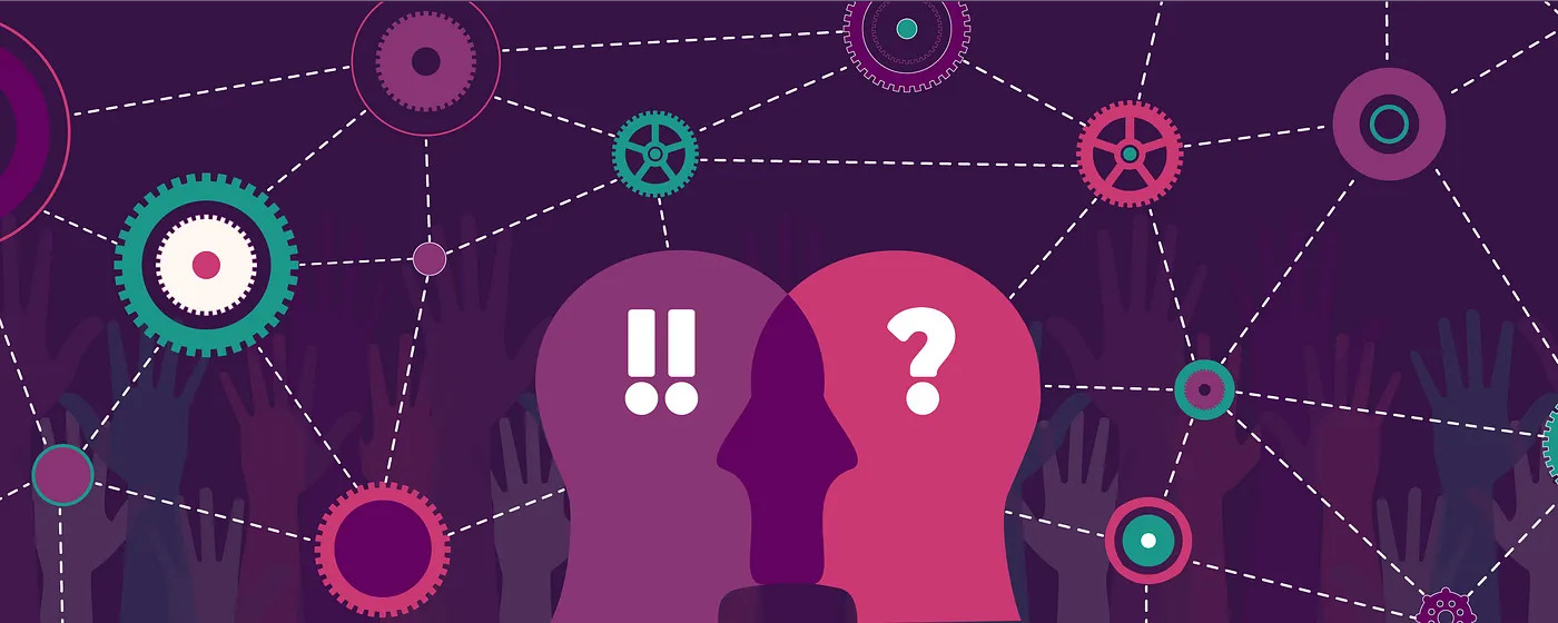
Highlighting What Matters
There were a few major hurdles we faced while redesigning Ally’s DE&I page, the first and biggest being data — lots and lots of data. One of the main jobs of the UX team is to look at all the provided information and, together with business partners, decide which pieces are worth highlighting and which ones are better left out. Include too much information, and you’ll lose readers’ attention. Leave out too much, and you’ll leave them wanting more. In our case, there were several important points the business wanted to convey, so we knew we had to find a way to organize and present everything in a way that effectively told the story, without turning the page into an ocean of information that could be difficult to navigate. Enter: sticky navigation (or sticky navs, as they’re called behind the curtain) and modals.
Sticky Navs and Modals
In case you aren’t familiar with these web tools, here’s an explanation of both, starting with the sticky nav.
Here’s what it looks like for Ally’s DE&I page:
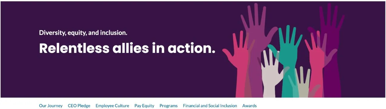
See that navigation below the banner? It’s an important tool that provides a designer with the ability to break up a web page into manageable chunks. Think of sticky nav headings like chapters in a book. Click on the chapter you want to read, and you’re taken there. The navigation follows you down the page (hence the “sticky” designation), so, if you decide you want to go back to the top, or to a different section altogether, you simply click on your next choice, and the navigation will send you there. Regardless of where you go, the story is always there, in order, on the sticky nav.
In addition to breaking up the story, the sticky nav serves another very important function. Designers build each “chapter,” or, section of a page in such a way that it can be linked to or from another source. What this means for Ally is that if any team member wanted to highlight our employee culture on another web page — or even through a customer or employee email — the sticky nav provides the ability to create a hyperlink that will connect not only directly to the web page, but to that exact section of the web page.
Moving on to the modal — here’s an example of one that I used to share information about Ally’s Employee Resource Groups (ERGs):
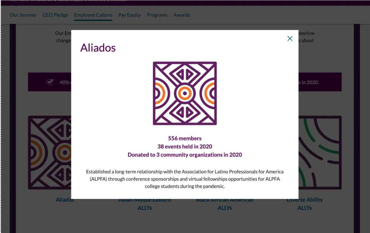
The image shows us that a modal is a box of information that remains hidden behind a hyperlink, until clicked. The modal can be small, or it can be extra-large, depending on the amount of information you’re conveying. The biggest advantage to using a modal is its ability to save valuable scroll space on a page.
For the updated Ally DE&I page, our business partners wanted a much more robust representation of the ERGs than what was shown on the original page. However, as you can guess from the sticky nav I showed earlier, our page included a lot of other “chapters” that we needed to highlight, as well. Adding in all the ERG information directly to the page would have created a significant amount of extra scrolling for the user.
Also, because each ERG represents something different, a user might not want to scroll through all 8 ERGs to find the one they’re looking for. Using a modal allows users to pick and choose the information they want to see — similar to the sticky nav — but through the simple click of an on-page hyperlink. Housing the information this way provides the user with an easier experience than needing to sift through all the text for each of the 8 categories directly on page. And when users are done, they simply “X” it closed, and they’re back where they left off.
Tying It All Together
Finally, here at Ally, UX designers have the ability to not only design the page, but to build it as well. We leverage advanced technology capabilities that enable us to have control over the project and how it’s presented from beginning to end. I no longer need to hand my work off to a separate development team to be added into a bi-weekly sprint cycle. Instead, I can create a page within a day or 2 timeframe and have it tested and published shortly thereafter. And, even better, I can make future updates and additions on the fly, saving the company both time and money.
If you have a moment, I encourage you to hop over toAlly’s Diversity, Equity, and Inclusion page and explore a bit. Follow the journey and notice the subtle ways UX plays a role in making the experience not only engaging, but meaningful for the user. I think you’ll discover, once you look a bit closer, that what you’re seeing is so much more than just a web page — it’s a story. Ally’s story. A story our team — and company — is proud to share with you.
Interested in joining Ally's team of talented technologists to make a difference for our customers and communities? Check outAlly Careersto learn more.