Removing Designer’s Bias with Wizard of Oz Screen Reader Usability Testing
- Annabel Weiner & Courtney Benjamin
- 6 min read
Even the best-intentioned digital experiences can have biases based on who creates them, and this can create a frustrating and time-consuming customer journey. On Ally’s Accessibility team, one of our goals is to not only meet accessibility compliance guidelines, but to reach beyond them to provide the best experience for people with disabilities — especially since our team consists of sighted individuals. To make experiences easier and more enjoyable for everyone, we need to test our designs with people who are blind through all design stages. As we worked towards this goal, we looked to incorporate usability studies with people who use screen readers earlier in the design phase. Because screen readers read HTML, we were previously only able to test screen reader usability after a project was developed and we had a working website or app. While it’s useful to get feedback on live sites, it’s easier, cheaper, and more efficient to make design changes before a project goes into development.
So we asked ourselves: what if we didn’t have to wait until an experience was developed? What if we had an expert on our team to act as the voice of the screen reader, our own “man behind the curtain”, giving real-time responses while participants voiced how they would navigate through the page? Our teammate could listen for the participant’s commands and then respond as common screen readers like VoiceOver or NVDA would respond. Our team was inspired by a talk at axe-con last year where Christine Hemphill and Tom Pokinko suggested doing a screen reader “Wizard of Oz” test using a paper prototype, and we wondered if we could create a similar study.
What is a Wizard of Oz test?
According to AnswerLab.com, “Wizard of Oz (WoZ) is a method where participants interact with a system that they believe to be autonomous, but in reality, is controlled by an unseen human operator in the next room. It’s a fantastic way to explore the experience of a complex, responsive system before committing resources and development time to actually build that system.” (In case you don’t get the reference, in The Wizard of Oz, the “wizard” of the title was actually just an optical illusion operated by an ordinary human man hiding behind a curtain.) At Ally, we’ve used this method to test experiences like chat and interactive voice response (IVR) — so why not try it with screen readers?
What we did
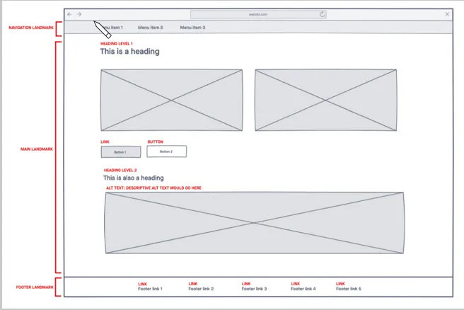
To plan for this test, we created a prototype that included accessibility annotations as an overlay, adding elements like heading levels, landmark regions, and icon alt text, as well as the name, role, and value of components. We used language that was more detailed than we would usually provide for accessibility annotations, since we weren’t relying on our development team’s help for this test. These notes helped to guide a teammate who played the role of the “wizard” or screen reader during the test, so she could easily hop between these elements if a participant requested it. “The wizard” used her voice to provide real-time responses to participant commands, speaking consistently and clearly to mimic the robotic sound of an actual screen reader. It’s important to note that our team has a certified NVDA expert, which helped us to interpret the intricacies of screen readers.

Before we began, the moderator described the purpose of the test and gave participants instructions on how to navigate through the prototype. Instead of using a keyboard-controlled screen reader, we asked participants to voice their screen reader commands like “read forward”, “tab”, or “next heading”. While going through the test, the moderator and “wizard” alternated between the live screen reader exercise and gathering feedback and having discussions with participants.
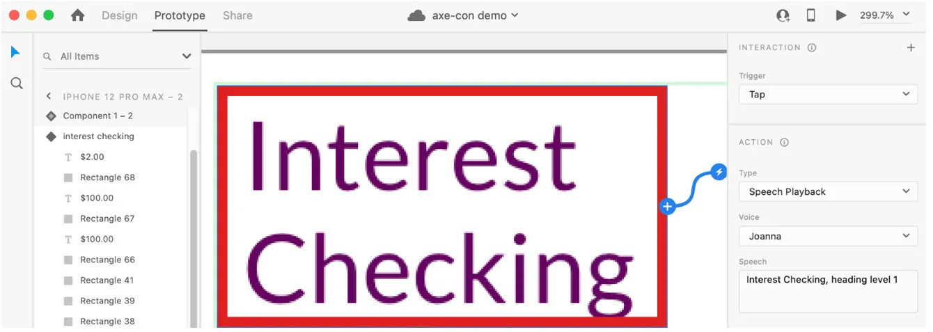
Inspired by the Wizard of Oz testing process, we also experimented with building a prototype using Adobe XD as a soundboard. We programmed screen reader language into different clickable elements, which meant that the “wizard” was no longer using their voice, but still manually activating the prototype hotspots. In this version of the test, the audio became more automated and robotic like a screen reader, and we found that participants grasped the concept more quickly than when we used a human voice for the screen reader.

We also noticed that using a pre-programmed prototype has some drawbacks, like decreased flexibility, and some of our participants got caught up in minor inconsistencies in the prototype language compared to VoiceOver or NVDA. However, participants were more forgiving about screen reader differences when there was a human screen reader.
Running this type of test helped us learn more about the ways that screen reader users interact with our digital products, and it’s given us the confidence to try more creative usability testing methods.
We learned:
To prepare for both “happy paths” and the more “winding road” journeys. Some users may want to explore the page thoroughly before selecting anything and will go down routes you didn’t see coming. Because of this, it’s important to practice and prepare for alternative scenarios where users could “get stuck” or come across a part of the prototype that is not operational. If a participant tries to go down a route that you haven’t built out, you can learn a lot by asking them what they expected to find there.
To administer the test sessions as a team. Having one person act as the “wizard” or screen reader and another person guide the participants through the experience and ask probing questions was essential to its success.
That every participant — our team as well as our screen reader users — learned something new. Our team learned a lot. We were able to pick up on invaluable nuances that will make our patterns clearer and more intuitive for not only screen reader users, but others of all abilities who use our products. In addition, our test participants learned new things, too. They picked up the concept of a simulated screen reader easily, asked questions and offered clear feedback. Treating a test like a mutual learning exercise is endlessly valuable.
Want to create your own screen reader Wizard of Oz test? We’ve got some advice to help make your journey as smooth as possible:
Focus your tests on pages with new elements that you know will repeat throughout your digital experience. It’s beneficial to test flows where you can apply findings to other projects or design patterns.
Ask participants about their basic screen reader preferences before the test. Tailoring your test to mimic their preferences makes the experience more natural for them — and gives your team the most useful feedback.
Be flexible. You’ll likely go back and forth between having a conversation with participants and having them interact with your prototype.
Practice with someone who knows how to use a screen reader but isn’t familiar with the project. With sighted individuals, ask them to dim the screen so they can’t see the prototype.
Have a separate moderator and “wizard”, who are both familiar with accessibility guidelines and assistive technology, partner together in running the study.
As hard as we try to make sure every experience is accessible, we all have unconscious biases and often our eyes get in the way. By including screen reader users early on in our design process, we found areas where a simple content tweak or an aria-live announcement would greatly improve the experience, and sometimes these changes were beneficial for sighted users as well. Furthermore, because we found these issues before a site was developed, we had more flexibility and more potential solutions than we would have if the site was already built.
This exercise reinforced to us the value of trying new usability methods — finding innovative ways to gather feedback from participants with all different kinds of abilities makes our products not only accessible, but enjoyable for all.
Interested in joining Ally's team of talented technologists to make a difference for our customers and communities? Check outAlly Careersto learn more.